Structuring Product Pages for User Clarity
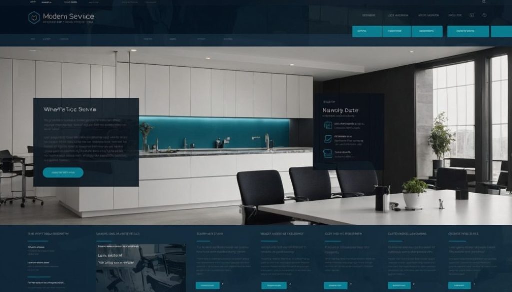
Even though our digital products haven’t launched yet, we’re already thinking about how we’ll present them. At ProjektExodus, we want every part of the site — especially product pages — to feel intentional and user-friendly. That’s why we’re planning early on how we’ll approach structuring product pages for clarity and trust.
Why Structure Matters
When a product page lacks clear structure, users hesitate. Too much information, or too little context, leads to confusion. Worse, it can cause visitors to abandon the page entirely.
By structuring product pages for user clarity, we create a more intuitive experience. Visitors can explore the content at their own pace, understand what’s offered, and feel more confident in their next step.
Structuring Product Pages at ProjektExodus
Here’s how we’re approaching the design of our product pages:
- Value First
The headline and opening paragraph quickly communicate the product’s value — what it helps users achieve. - Visual Hierarchy
We use consistent typography, spacing, and image placement to guide the reader’s eye down the page. - Key Features Up Front
Bullet points or visual cards highlight key features early, before asking for a deeper read. - Supporting Details Below
More detailed descriptions, testimonials (as we collect them), and any necessary specs appear further down the page. - Clear Call to Action
The CTA (whether purchase, subscribe, or contact) remains visible and unambiguous, with no clutter around it.
Balancing Information and Simplicity
One of the challenges we’ve faced is deciding how much detail to include. Too much can overwhelm; too little can leave users unsure.
Our solution:
- Prioritize what users most want to know
- Use progressive disclosure — show the essentials first, with the option to explore more
- Avoid walls of text; break content into digestible sections
This balance helps maintain flow and reduces cognitive load.
As we prepare our own product pages, we’re also drawing on proven best practices. Microsoft Clarity shares 10 practical steps to create high-converting product pages — from optimizing visual hierarchy to simplifying CTAs. These insights are helping shape how we think about page flow, content balance, and what elements to prioritize when our offerings go live.
As we prepare to roll out our first products, we see product page structure as a key factor in how users understand and interact with what we offer. Planning this early helps us ensure a smoother experience when we go live — and gives us a head start on building trust from the very first click.


