Building Better Forms for User Interaction
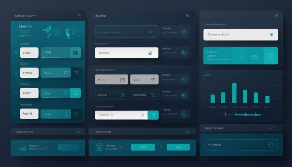
Forms are everywhere online — yet many sites still treat them as an afterthought. At ProjektExodus, we believe a well-designed form is one of the most important ways to connect with users. That’s why we’re paying extra attention to building better forms that make interactions smoother and more inviting.
Why Form Design Deserves More Attention
A form is often where the user decides whether to engage further — whether to subscribe, send a message, or complete a purchase. Poorly designed forms introduce friction; well-designed ones encourage action.
By building better forms, we aim to:
- Make forms easy to complete
- Ensure accessibility across all devices
- Reduce user hesitation by creating a trustworthy experience
Our Approach to Building Better Forms
Here are some of the ways we’re improving form design at ProjektExodus:
- Keep It Simple
We ask only for essential information. Extra fields add friction and reduce completion rates. - Clear Labels and Instructions
Every field includes clear, visible labels — not just placeholders. If instructions are needed, they’re short and to the point. - Accessible and Mobile-Friendly
We test forms for keyboard navigation and screen reader compatibility. On mobile, the form should be just as easy to complete as on desktop. - Progress Feedback
For multi-step forms (planned for future use), we’ll include progress indicators so users know where they are in the process. - Friendly Microcopy
A touch of warm, reassuring language helps users feel more comfortable submitting the form.
Avoiding Common Pitfalls
We also keep an eye out for common form design mistakes:
- Auto-focusing on a field that jumps the user unexpectedly
- Poor error messages that leave users confused
- Lack of confirmation or success feedback
- Using CAPTCHA in a way that frustrates legitimate users
By addressing these issues early, we ensure that forms help users — not annoy them.
If you’d like to explore more practical form design tips, Prototypr offers a great article with eight essential rules for perfect form design. From simplifying input fields to crafting helpful error messages, their insights align closely with our approach at ProjektExodus — keeping forms user-friendly, accessible, and clear.
Forms are more than a technical element — they’re a conversation with your user. By building better forms, we improve not only usability but also trust and engagement. At ProjektExodus, this philosophy guides how we design every form on the site — and we’ll continue refining this as we grow.


