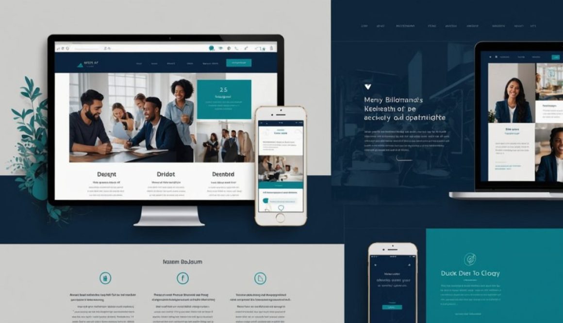
Building User-Friendly Navigation – Designing for Clarity

While many aspects of ProjektExodus are still evolving, one thing we agreed must be functional from the start is the navigation. A confusing or bloated menu can immediately turn away visitors, especially during a launch period. After structuring a website for scalability, today we share how we designed for clarity through building user-friendly navigation — even before finalizing all content.

In a project where speed, iteration, and flexibility are key, it’s easy to overlook elements like navigation. But for us, navigation isn’t just cosmetic — it’s part of our site’s communication and trust-building strategy. Let’s walk through how we approached it with simplicity, adaptability, and the user in mind.

Why Building User-Friendly Navigation Matters from Day One

Good navigation is more than design — it’s strategic UX. For a site like ProjektExodus, which is still evolving, clear menu structure helps visitors (and search engines) make sense of the site early. For a deeper dive into what makes website navigation intuitive, we recommend Navigation Menus – 5 Tips to Make Them Visible, a trusted source in user experience design.

Visitor Expectations

Users expect quick access to information. Even in early builds, a thoughtful menu reassures them of site quality.

SEO & Structure

Search engines crawl navigation links to map your site. Structuring early helps Google understand and index your priorities better.

Our Current Navigation Setup

We started with a lean set of menu items that reflect our site’s foundational structure:

Home | About | Solutions | Services | Products | Projects | Courses | Portolio | Blog | Gallery | Contact

This menu will evolve as new sections are published, but we intentionally avoided overloading it upfront. Each label is simple, direct, and intentionally left broad to allow future expansion. Rather than overwhelm visitors, this setup helps guide them logically through what we offer. We also made it mobile-friendly from the start, knowing a large part of our audience will visit from smartphones and tablets.

Building User-Friendly Navigation, How We Designed it On-the-Fly

Despite the site still being under development, we:

  • Prioritized clarity over completeness
  • Grouped similar content under meaningful labels
  • Created placeholders for future dropdowns
  • Ensured mobile responsiveness from day one

We’ll continue refining as user behavior data comes in, but this agile setup gets us started on the right foot.